Did You Enjoy My Magazine?

Which Title Block Do You Prefer?

Tuesday, 4 May 2010

Evaluation

In what ways does your media product use, develop or challenge forms and conventions of real media products?
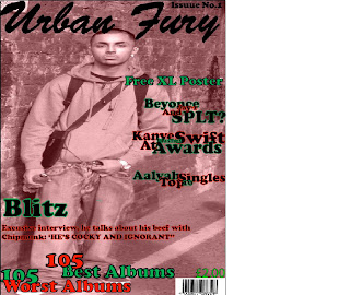
My media product uses conventions of a real media product as it is based on the same thing. I analysed three magazines in my free time and noticed the similarities, when making my magazine I incorporated these similarities. Some of these are barcodes at the bottom right hand corner of the page, and above it I placed the price, also the issue date was placed in the top right hand corner just above the title. I noticed that the title always had the biggest and boldest font, second was the buzz words then the anchorage text. In each of these magazines a main image was used and occasionally a few smaller images were placed on the front cover; I however only incorporated one image in my magazine to make it the main focus. My media product challenges other magazines as most magazines are very full mine however is very simple and plain I did this as I find that the magazine suites a plain layout. A real magazine would have more going on, more buzz words, a better anchorage text etc as this is not a real magazine I planned it out to suite myself and my style which is why it has obvious similarities and obvious differences to real magazines.
How does your media product represent particular social groups?
Due to the fact that it is an urban magazine the product does generally represent an urban social group. The urban group does not have limitations to colour or gender, it is generally just for people who are into the urban lifestyle. This is stereotypically teenagers/ young adults. This is because they have the time to read magazines such as this one and explore the vibrant urban scene. The central image is of a young male who is standing in quite a firm position, one of his hands is in his pocket which shows his body language, this means he has quite a bit of attitude, his facial expression indicates attitude also. The artist on the cover is a young male who is dressed in urban clothing (baggy), the particular social group is most likely to be young teenagers who are interested in this lifestyle. The image is taken in a direct mode of address which shows the artists trying to build a relationship with the reader. This is straight forward which is what teenagers want. As the magazine is only £1:50 it's affordable for young adults/teenagers as it's not to expensive yet not extremely cheap. The colour scheme is quite odd as red symbolises passion anger or love whereas green usually symbolises envy, this allows the target audience to be larger as people may percieve the magazine in different ways.
What kind of media institution might distribute your media product and why?
Bauer might distribute my media work as it is a very large company. Bauer is one of the largest institutions around that till this day is very successful, also they distribute both niche and mainstream magazine which is useful to know in case I plan to expand my magazine. Similar to FHM i plan to distribute my magazine once a month and as Bauer have experience in this it seems appropriate to work with them. Also Bauer have a variety of magazines which show their versitility. The Bauer media institution has a wide variety of magazines and it also taps into other aspects of media such as television adverts as well as channels, successful radio stations and promotion online. I would like Bauer to distribute my product as they will promote it well and so far all their products have been successful. They vary in their magazines which is good as they aren’t biased in that case. They are very well known and have regular readers, listeners and viewers which Is a good indication that they will sell my product well. They use the internet to promote their products; certain ways of doing so is pop ups and adverts on websites. Also by using Bauer they can tap into their radio fan base and existing magazines to promote mine which evidently will help make it successful.
Who would be the audience for your media product?
The target audience for my magazine would generally be teens/young adults who are interested in this lifestyle, the urban lifestyle. As the music genre is mostly Rap and R’n’B it would appeal to a younger market as they have time to listen to this music whereas the working class and an older person wouldn’t have time in their daily routine to regularly listen to this music and understand what is going on. I have chosen this target group as they take an interest in r'n'g music aswell as gossip which is exactly what my magazine offers. It is very unusual to find a magazine that is a reasonable price for young adults which is why i have chosen a cheap-ish price along with this specific audience as there is a large gap in the market for this. Paying for the magazine surely wont be a problem for the audience as they have EMA, pocket money, part time job etc which allows a small amount of money to come through. The audience is not limited to male or female but explores both genders making the target audience bigger which hopefully will boost sales. The target audience will not have a specific age as this will limit a lot about the magazine instead we are aiming to attract as many people interested in urban music, not allowing anyone to feel secluded. However it is very clear that a young adult is the main audience for this product as young teens won’t have enough money to constantly buy the magazine whereas most young adults have some form of money coming.
How did you attract/address your audience?
By placing a British emcee on the cover the readers immediately relate. The image was taken in a direct mode of address which allows the readers to builds up a friendship with the artist. The image taken was full of attitude due to the artists’ body language and facial expressions. I gained knowledge from the questionaire i had carried out before making the magazine ensuring i knew exactly what the public wanted for example i learned that more than 50% of the public prefered music magazines and listened to r'n'b. This allowed me to start a base for my magazine and work around that.This is how i created my theme. The stories inside the magazine are very contemporary not only does it talk about the music charts but it also explores the controversy in the business. Celebrity scandals help with this. The colours are quite bright and vibrant which evidently will attract a younger market as they like things that burst with colour, whereas the older market are more drawn to simple and bland things which seem to be un complicated. The audience is addressed in a very common way, when writing articles and exposés the readers are spoken to and not simply written to, they are addressed as if the writer is talking to them one on one unlike other magazines where the audience is spoken to as a whole. The buzz word helps with this as it attracts the audience by the 'free xl poster'. Immediately the reader is drawn to this especially as it stands out on the cover and is free, which makes them feel as though they have got their money's worth.
What have you learnt about technologies from the process of constructing this product?
I have learnt that it takes a lot of effort and skill to produce a magazine of a good standard. The main two technologies i have learnt about were Photoshop and Blogging. Technologies such as ‘Adobe Photoshop’ and ‘Illustrator’ are very hard to use the drawing too, airbrush and colour changer takes time to adapt to. When using this application one has to play about with it before applying anything to the document as mistakes are easily made and rectified. Layering is very important when using these applications so that the original document stays the same but you can make changes to an identical document. I gained more experience when using a digital camera, although this was not the first time i had taken images i immediately started to think about how it would effect my magazine. I began focusing on the lighting, the angles and weather or not it should be a direct mode of address on a non direct mode. Mainly i focused on the shots and weather or not it should be mid-shot, close uo, exreme close up etc. Also the internet was used a lot for my research I learnt that Google is the best search engine and that the internet is very useful when you look in the right places for information. I used blogsopt in this unit which allowed me to display all my work online without complications, i learned how to upload my work, to add images and create polls allowing people to vote on my work which evidentlly would help with my evaluation. Using UBS’s is an easy way to save and transfer work which helped me a lot throughout the duration of this product. Other underrated applications are things such as paint which help to transfer images from one application to another when copy and paste is not in use, knowing when to save images as JPEG and the size to make it is a lot.
Looking back at your preliminary task, what do you feel you have learnt in the progression from it to the full product?
At the beginning of this task everything seemed hard to use all the programmes and so on, as the progression of the task went on I learnt how to use this application and gain some skill. Things that seemed hard before became very easy and interesting to use as I learnt many new things. This is clear by the draft and the final they look completely different although it may not be the best it takes time to learn how to use these programmes. I worked with a camera in many different locations trying to get the best backdrop to suite my theme and while editing my magazine I learnt how to blur tools, resizing, placing images in front and behind of each other, adding shadow, changing colour, sharpening text etc. Also i had made a college magazine without any research, once i had done my research i was able to improve my designs and make my music magazine resonably good. The college magazine was very boring, not alot of colour and lacked any attraction, it was also done in publisher. Whereas my final magazine is bright and attractive to some people, and was done on photoshop and illustrator.
Audience Feedback
The audience feedback is very important and plays a big part in my coursework. I received honest opinions from my peers which has helped me to recognize where i could have improved my work. The polls on my blog enabled the public to give me their opinion. My first poll gave people the option of four title blocks, i was unable to choose one due to the fact that all the title blocks got the same amount of votes showing they are all reasonably good or reasonably bad depending on which way you look at it. It allowed people to pick the most eye catching title block. My second and final poll was about my magazine and what they thought about it weather they enjoyed it 'yes' 'no' or it 'nneds improvemement'. This made me realise that as a whole the project could have been alot better as the magazine was not the best part of my coursework. My fellow peers recognised this and voted without being biased, giving me criticism for next time i use these publications. The questionnaire allowed the audience to chose the features in which they wanted in the music magazine such as the genre, distribution, well known artist interviews etc. This helped me to create and build my own music magazine.

Title Blocks

Title Block 1:


Title Block 2:


Title Block 3:


Title Block 4:
I posted a poll to see which title block would be most suitable for my magazine in the publics eye. This gave me mixed answers with title block 1,2 and 4 getting the same amount of votes. This meant that title block 3 was definatelt not suitable for my magazine. In the end as i could not choose a title block out of the three i decided to take a risk and use a similar font to title block 2 with a few adaptions encorporating certain aspects from title block 1 and 4 i made my perfect title block which ended up suiting my magazine the best.

Draft Of Magazine


Final Magazine


Saturday, 1 May 2010

Detailed Layout


Independant Research


1) Bauer media produce both mainstream and niche magazines. They vary in these types of magazines and focus on many different genres. They publish magazines from men’s entertainment down to gardening. Their target audience vary depending on which magazine or radio station they are advertising at that time. Although this is the case, men’s lifestyle takes 33% of the sector, making men the main target audience. There are many links between magazines and other media. As a result of the success of Kerrang and Q they have resulted in radio and TV channels. Also there are 7 digital music channels such as Kiss, Magic and Box Hits. ‘FHM’ is a mainstream magazine whereas ‘Kerrang’ is a niche. They both focus on different topics although they do have a certain amount in common. ‘FHM’ explores sports, cars, women and music whereas ‘Kerrang’ only focuses on music. Although Bauer media have a variety of magazines it is clear that music Is their main focus as the radio stations and TV stations are without a doubt the most recognisable and most successful in this company. Most music magazines will promote their entertainment publications using the internet (websites as well as pop ups on Google), television adverts and radio adverts as an alternative for the magazine. This gives the readers a chance to clearly see up and coming tour dates additionally they can find new information on the artists.


2)IPC Media produces over 85 iconic media brands, with our print brands alone reaching almost two thirds of UK women and 44% of UK men –almost 27 million UK adults – while our online brands collectively reach 20 million users every month. IPC’s portfolio includes Nuts, Loaded, Now, Marie Claire, NME etc. An example of a mainstream is Marie Claire as it focuses on beauty, true life stories, fashion etc, whereas a niche such as NME only focuses on one topic; music. The target audience for NME are for people who are into rock, indie music and Britpop. They are most likely to be teenagers – young adults as people that are older than 25 may not have time to listen to music as much as the younger generation.IPC focus on the magazines they have which is why they haven’t expanded to television or radio. As most of their magazines are niche they have one set topic which makes it harder to publish interesting stories continuously.
IPC have a website to allow the readers to get information needed and also allows them to promote themselves online.


3)The BBC incorporate magazines publishing with their radio and television output. This means that the magazines will appeal to everyone, teenagers, young children, young adults etc. This means they have the biggest target audience as there is something for everyone. The BBC offer magazines such as ‘Cebeebies’ for young children, ‘Top of the Pops’ for teens etc. This allows the target audience to be mor4e committed to buying the magazine as it is generally what they want unlike a gossip magazine that they buy for entertainment. The BBC are aiming to promote their television programmes through these magazines also they are educating the readers further about specific topics as nearly every magazine in the BBC is a niche which means it’s dedicated to that topic.


(No Image)
4) Development Hell is an independent media company that focuses on publishing two niche magazines monthly. These are ‘Mixmag’ and The Word’. The target audience is without a doubt adults as it’s liked to the magazines Dontstayin.com, a social networking site dedicated to a breathtaking clubbing experience, the target audience clearly has to be over 18 as generally that is the legal age to go clubbing. Development Hell is providing the readers with things they love such as club and dance. As they only publish to magazines it’s clear that they are focused on this niche magazine or they may not have the funds to sell more as the ‘Mixmag’ has a free CD in every issue which amounts to a lot of money.

Thursday, 1 April 2010

Questionnaire Results


Questionnaire

This is a questionaire i have created and passed out to get information from the public which will help me in the making of my music magazine as i can base my planning on the answers i recieve. (30 people took part)

1.What Sex Are You?
Male
Female

2.How Old Are You?
Under 16
16-20
20-25
25-30
Over 30

3.Do You Listen To Music Regularly?
Yes
No
Occasionally

4.What Music Do You Listen To?
Hip-Hop
R’n’B
Indie
Heavy Metal
Rock
Classical
Country
Gospel
Other (Please Specify)...

5.How Often Do You Buy Magazines?
Weekly
Monthly
Barely Ever/Never

6.What Type Of Magazines Interest You?
Fashion
Sports
Music
Other (Please Specify)…

7What Type Of Artist Would You Like To Be Featured?
Underground Artists
Mainstream Artists
Both

8What Price Do You Think Is Suitable For A Music Magazine?
£1
£2
£2 +

9.Would You Mind The Magazine Promoting Things Unrelated To Music?
No
Yes
Maybe/Depends

Tuesday, 30 March 2010

Title Analysis 3


The ‘Rolling Stones’ is a music magazine, which also focuses on politics, popular culture and news. The style of the title suggests the magazine is an old one, this can be seen from the font and the shading. ‘Rolling Stone’ is an American based magazine and is sold all around the world as it has become increasingly popular over the past four decades. This also shows that it has a sixties influence as it has developed since then.

The two colours used in this title block are red and grey. Red usually symbolizes anger, passion or love whereas the grey symbolizes mystery. When linking this to the magazine it’s clear the contents is very passionate especially the serious articles also the readers are attracted to the mystery of the grey which grabs their attention and makes them buy the magazine. These two colours have completely different meanings keeping the reader interested.

The word ‘Rolling’ is the only indication to what the magazine is about as everything else is very mysterious. This word is directly linked to the genre of Rock’n’Roll as the word ‘Rolling’ is shortened to suit this theory. This gives the readers an idea of the type of music magazine ‘Rolling Stone’ is. This being the case there’s nothing else in this title block that indicates the target audience or the contents of this magazine. The font is very classy yet still edgy, as the curls at the bottom make the title less boring.

The title itself has a shaded background for every letter; this shows that the magazine is creative and artistic as most music magazines usually have a block bold font with no shading, making it very common. This also suggests that the magazine is quite vintage as the title is so uniquely different from a more modern magazine.

From the title it’s clear the target audience is not teenagers. Instead it’s for people who are interested in music as well as general popular culture; therefore it seems to be the target audience are university students, politicians and the middle class.

Title Analysis 2


The genre of this music magazine is a Hip-Hop/R’n’B one. This is clear by the vibrant colours used as the urban scene use fun bold colours to attract its target audience, also this is a representation of its vibrant and outgoing lifestyle.

The title has a very simple font and is bold. Usually urban magazines use simple fonts and draw attention to the magazine by making it bold, (symbolising loud music) and colourful. The colour is what attracts the readers and as the background is deep blue, and the title is in white which is very pure and makes it stand out even more. Also white symbolizes purity which could be linked to it’s target audience.

The font is bold and very large suggesting that the magazine is the same, as the title is a major part in the representation of the magazine, this is a clear indication to the readers that the magazine will be interesting, exciting and ‘in your face’ as that is what the boldness is suggesting.
The title ‘Vibe’ is very catchy it is directly linked to the R’n’B/Hip-Hop theme. The word ‘Vibe’ is mostly used among young adults who are into the urban scene, it also suggest the type of music magazine it is as the title is generally used by people into this specific genre.

Due to the colours used, as well as the font it is clear to me that the target audience is for young people. As Hip-Hop magazines are very controversial and explode with colour a younger audience will be more attracted to them. The magazine gives clear indications that the target audience may be people between the ages of 14 – 22.

Title Analysis 1


The title is quite extremely eye catching, the boldness of the letters is forced on the reader, and this gives me an indication that the music magazine is quite dominant and loud. The genres that represent this are heavy metal, punk, rock etc.

The colours used are black and white. These two colours clash which means that the black makes the title even bolder. The reason these colours have been used is to enhance the rock/punk theme of the magazine as generally/stereotypically this is the colour that is mainly used by them, and is more accepted than bright colours as it is dark and represents that type of music.

The font is very simple. It is bold to add to the rough effect of the magazine. The shuttered glass effect through the boldness of each letter illustrates the loudness and rawness of this magazine. The rough edges around the casings suggest that this magazine is not for posh people and more for rebels as it is not perfect. All the letters are set out very normally apart from the ‘A’ which stands out immediately once analysing the title. The ‘A’ is coloured in which breaks the pattern and shows a more rebellious streak. This may link to the target audience of the magazine as it relates to rebels. Also, the exclamation mark at the end of the title shows a sign of dominance. Exclamation marks are generally used to make things loud; this gives the readers and exciting feeling.

The title ‘Kerrang’ is a reference to the sound made by an electric guitar. This is directly linked to the theme of the magazine as many rock and heavy metal bands use electric guitars in their music. The cracks in the glass are a direct result of the damage this sound makes.
From title I get the impression that the target audience is teens and young adults (16-25) as at these ages’ people are still going through rebellious phases.

Feature Article (Interview) For My Magazine


Above are the two images i am considering using for my feature interview below.
INTERVIEW!

Here at Urban Fury magazine we had the pleasure of meeting Blitz, a new up and coming British grime artist who is exploding in the music scene. As he walks into the hotel room where we have set up this meeting the atmosphere immediately changes, followed by 2 body guards and an entourage, it becomes clear just how much a success he is. Not only is his swagger in check but his skin is also flawless, no blemishes, no marks, just smooth and radiant. We have the exclusive and here is what happened when one of our journalists met this up and coming super star and grilled him with questions.

Kayleigh: Hi, it’s nice to meet you Blitz, how are you today? (shakes his hand)

Blitz: Nice to meet you to, I’m fine just a little tired, busy schedule and all that.

Kayleigh: So you have made it from underground music on local TV channels to mainstream music on MTV and all the major music channels, how did you achieve this?

Blitz: (laughs) The underground music scene is very underrated, there is so much talent out there but because they lack funs they are pushed aside, I was lucky enough to get signed to Dizzie’s Rascals label as he was at a show I did and liked my flow, its as simple as that one underground show got me to where I am today

Kayleigh: So would you say it’s just luck?

Blitz: Luck and latent c’mon I wouldn’t be here if I wasn’t good at what I do right?

Kayleigh: (someone’s very cocky) I agree, let’s get down to business, who inspired your music, lets face it you’re unlike any other grime artist we’ve seen.

Blitz: Nah, I’m just a regular guy making regular music, Jay-Z, Eminem and Kanye West are major influences on my music, they speak the truth and that’s what got them where they are today. Eventually I want to expand from grime and move onto rap, it plays too much of a part in my life for me not to explore it.

Kayleigh: (looks around the room) Even though you’ve only been in the game a few months you already have beef with a fellow artist Chipmunk, how did this happen?

Blitz: (Stares blankly) Well, hmmm, him, he’s just too cocky, I don’t like that. Our labels have beef so I automatically got brought into it but he tried to send for me at a show so I had to retaliate and as of today I haven’t heard a reply, it’s madness, he’s ignorant and still has the mentality of a little boy, I think he needs a break and needs to get out the music bizz, he hasn’t been making any bangers for the past year (chuckles to himself)

Kayleigh: Oh wow, seems serious then, why not put it behind you and collaborate

Blitz: (Kisses His Teeth)

Kayleigh: What’s your view on the P-Money and Ghetts situation?
Blitz: I wish you didn’t ask me that, they’re both my boys but Ghetts is getting destroyed, I give Money ratings he’s going hard and at the end of the day that’s all you can do, so yeah Money gets respect for that

Kayleigh: So, what’s your view on Ghetts?

Blitz: Ghetts hmm Ghetts, his music is more to please the public, more pop whereas Money’s music is real it’s greezy, that’s why I can’t comment on Ghetts I don’t get the pop scene and I never will.

Kayleigh: (ignorant much?) So you will never collaborate with a pop artist then?

Blitz: Collaborate definitely but it will have to be on a grime track, I’m not changing my style to suite the public.

Kayleigh: Blitz, you’re a very interesting character, I didn’t expect this interview to be anything like this.

Blitz: I’m happy I could surprise you (winks)

Kayleigh: (Giggles) the question I know every teenage girl has been waiting for me to ask is are you single?

Blitz: Very single, yes. (Smiles)

Kayleigh: Well I’m sure that won’t last, what can we expect from you in the future?

Blitz: My first single was quite heavy, very real and it went top number one so hopefully my second single will do the same. It’s more of a summer kind of tune so yeah hopefully that will help my album get more noticed.

Kayleigh: Seeing as this is an exclusive are we going to get a sneak peak?

Blitz: Yeah the tune is called ‘freestyle fronters’ (mc’s a verse for the crew)

Kayleigh: I’m very impressed

Blitz: Thank you.

Kayleigh: No. thank you for coming down, it’s been very nice meeting you and hopefully we’ll be hearing from you in the future, good luck with everything. (Shakes hand)

Blitz: You’re welcome, and yeah hopefully you will, I’ll keep your best wishes in mind.

Apart from his cockiness in the beginning Blitz is a very humble, young man. The crew were all very impressed with his skills and manners. The flirty aspect he brought to the interview made the atmosphere casual and pleasant. All in all he’s one to watch in the future, opinionated, dedicated and skilled, we’ll definitely be hearing much more of him and his controversy in the future !

Kayleigh Sphere.

My Magazine Plan

The target audience for my music magazine will be teenagers/young adults between the ages 15-22. The reason I have chosen this age group is because young people take more of an interest in celebrities, music, fashion etc. therefore it’ll be more likely for them to purchase the magazine rather than a middle aged person or parent as they are more focused on life lessons and what can benefit them, not music magazines.

The genre will be R’N’B and Rock as the two mixed together has been proven to be a huge success an example of this is when Linkin Park and Jay-Z collaborated and went on tour together. I think it will be easier to focus on one or two genres rather than having them all as there would be too much going on causing confusion for the reader, whereas if there’s a limited genre there will be a specific target audience which makes it easier to promote and sell the magazine.

My magazine will come out monthly instead of weekly because this way it wont get boring, the readers will look forward to the magazine and there will always be new gossip/news in every issue whereas if it was distributed weekly there’s no guarantee there will be exciting news in the music industry. Also many music artists are in gossip magazines which makes it harder to bring out something the buyers haven’t read or heard before, which is why thought and care has to go into every issue; this means having a monthly magazine is more efficient.

My magazine will cost £2.50. This is a reasonable price for a magazine which is only published once a month. The target audience can afford the price of the magazine which is why I have chosen it. Also, other magazines such as glamour have a similar target audience and cost, even though the magazines are completely different the magazine has been successful which gives me hope that my magazine will be just as successful if not more as the two have so many similarities.

My magazine will definitely be glossy as this is more appealing to young people. Newspapers are filled with many stories and a lot of articles, many young people just want small paragraphs to read and many pictures. Like Q magazine my music magazine will be colourful and eye catching, it will have many images. Although glossy magazines mainly attract females my magazine will not have a feminine touch to it, it will have elements that attract both males and females, for example the colours will be neutral and the information will not be biased inside the magazine. Another reason I have chosen to make it glossy is because my music magazine will have quizzes and posters inside, this will look better in a glossy magazine than a newspaper style magazine.

Double Page Spread Analysis 2


The choice of artist in the article suggests the target audience will be teenager-young adults, generally people who are interested in the urban music scene. This is obvious as the artist is dressed as Hip Hop artists dress (baggy clothing and trainers). Also his hand on his face is seen as a ‘hood’ pose which indicates that the audience will be those interested in this lifestyle and music, most likely young people.

The language used in this article is quite common in magazines. It is quite formal but not boring and over bearing. It has a laid back feel to it which in addition compliments the bands language which is casual yet proper. It becomes apparent that the article is about a British band as stated they are ‘The best emcee’ this is a term only used by British people, also adding a few swear words allows the readers to feel comfortable as it is not formal as the swearing is not used out of context; ‘it’s frustrating seeing rappers talk about the same shit’.

The colour theme is black, red and white. The questions and quotes are in bold red, this could mean many things as red symbolises anger, passion and love. Putting this into context it’s clear the artist is very passionate about his love for music and he does get angry when talking about the style of other rappers. The writing is in black which isn’t unusual as all magazines use this colour and font. In contrast the background is white allowing everything else to stand out, white also symbolizes purity. Most of the writing is in Times New Roman approximately size 8 font this isn’t unusual as most magazines use this style in their double page spreads. The questions and quotes however are set out in a bold red Times New Roman which draws attention to it immediately giving the readers no choice as their eyes are automatically drawn to the question. The title is in bold and black however the font is unknown, it is different from everything else on the page but still matches the theme as it is very simple.

The double page spread is laid out very simply. On the left is the main and only image of the artist whilst on the right is an interview. The title is at the top left hand corner whilst the actual interview is below set out in columns. The double page spread is split up evenly one page dedicated to images and the other to writing.

The tone of the magazine is very firm, the magazine addresses the reader as a fan/ friend which is why the questions are all so serious and about music, none of the questions are about the artist’s personal life. The artist is presented to the audience as a very strong and firm person as the image isn’t sweet or pretty but more raggedy and assertive.

The style of the magazine matches the style of the front cover as the colour theme is the same and the title has the same font other than that everything is different. It is still consistent and is clearly from the same magazine. The article does need some prior knowledge when reading it as the questions are mainly based on the artist’s albums, past and gigs in the future. This means the reader has to have a rough idea of what the artist has done to understand certain aspect of the article; however the readers also gain knowledge about the artists that they might not have known before the article.


Double Page Spread Analysis 1

The choice of band suggest that the target audience for this article will be people who are into heavy metal as ‘Slayer’ is an old American band who have been creating music for many years. They are seen as legendary because they have been around for so long. This shows that the target audience will be those who listen to that genre of music, generally the older generation as they would have been around when ‘Slayer’ first came out however some young people may also enjoy this article as they are into rock and heavy metal, they will have more fans than a band who have just recently been introduced to the industry.

The language used in this article is far from formal; unlike other magazines this one takes a more casual approach. When asked questions Tom Araya and Kerry King answer as if they are talking to a friend, which shows they are trying to build a relationship with the reader and make the article/interview more personal. When asked ‘If you could be God for a day, would you make the world a better (or worse) place?’ Tom responded with ‘I’d pee on everything’, this language isn’t unusual in the rock world as they are just being honest and not sugar coating things to suit the media. Also there are a few references to swearing which proves this is a casual interview. A fan asked a question ‘If you had one day to live how you would spend it?’ again Tom replies with ‘Fucking my wife…’ Swearing is not frowned apon in this magazine as it fits in with the rock theme and completes the rebel look.

The colour scheme in this two page spread is very simple. The three colours used are white, black and lime. The main and only image of the two band members is in black and white this could be to represent the fact that they have been in the industry for many years. Also lime could be represented in two or more ways, I find that the colour reminds me of poison and jealousy. It is ironic that this colour is used as a border and background for the questions asked by fans. The lime makes the page look less boring and adds a vibrant effect to the page. The text is simple, effective and readable as it is common in most magazines.

The double page spread is set out very simply. The image supporting the article takes up most of the space, starting on the left hand side of the page and taking up a chunk of the right hand side of the two page spread. The image and columns are not perfectly aligned showing that the band is not perfect, also heavy metal artists are usually messy e.g. ‘Ozzy Osborne’. The actual article/interview is set out like a newspaper article. The quotes taken from the interview are in a very large font. They are used to grab the reader’s attention; this will make them want to read the actual interview an example of this is when he says ‘Metallica has got to make a better album’ this shows that they are criticism another band which will intrigue the readers.

The article is clearly made for the benefit of the fans as the questions submitted are from fans wanting to know ‘Slayer’ view, by addressing the readers as friends the tone is set and makes the readers feel comfortable and at ease while reading the magazine. The artist is presented as very laid back and quite rough in the image. They both look like ordinary people which would appeal to fans as it allows them to relate to the artists. This is achieved with simple clothing and rough hair.
The style of the article matches the front cover as the colour themes are the same, the fonts are consistent and the overall style is practically identical although the layout is different it is still clear they are both from the same magazine. It would be ideal if the readers knew a bit about the band before reading the article, this becomes clear when they talk about the guitarist ‘Jeff Henneman’ in the article which would mean the readers would have to be pretty dedicated fans to know this. However the interview gives out information that allows to readers to add to their knowledge about the band.


Monday, 29 March 2010

Contents Page Analysis 2


This magazine uses images to illustrate their contents. Each image is linked to and article and the page of this can be found on the bottom left hand corner of the image or the top left hand corner of the image. The images take up more than half of the page, the start from the left hand side and work their way to the right side with a small column for the actual contents. The main story has the biggest image with eight other small images surrounding it.

The images support the theme of the magazine ‘Kerrang’ as the magazine is a rock music magazine all the articles and image support this as they fit in with this genre/ theme. The contents definitely work for the magazine and keep its intended audience as it is very similar to the front cover.

There aren’t any vibrant colours in this contents page, which is expected as ‘Kerrang’ usually use dark colours. The only two bright colours used are red and yellow; this is because black, red and yellow are the colours of ‘Kerrangs’ logo, this shows it supports the theme of the front cover.

There are nine different sections in this case these are, ‘Feedback’ – ‘News’ – ‘Live Reviews’ – ‘Features’ – ‘K! Icons’ – ‘Album Reviews’ – ‘Gigs’ – ‘Swag’ and ‘Famous Last Words’. Just by looking at this page the reader can tell it’s a music magazine as it has references to gigs and reviews etc, it also tells us that It focuses a lot on celebrities but is not a gossip magazine.

There is one promotional feature at the bottom right hand corner, allowing readers to get this magazine delivered to them at home for on ‘£6 a month’. It provides a website and telephone number which makes it easy for the readers to get.

The logo of the magazine is not placed on the contents instead they have images of front covers above the promotional feature. This is very dominant as the feature is the only bright colour on the page which draws attention to the reader’s eye immediately as the red is very intense.

Contents Page Analysis 1

This magazines main image in its contents are of the ‘Foo Fighters’ as they are the cover feature, it also has three other images on the left hand corner which link to three articles in the contents list, the readers know this as the page of the article of on the bottom left hand corner of the images.

The support in my initial findings suggests the style of the contents page is there to keep the magazine very simple yet effective. The contrast between the blue and white make this clear as there are no bright colours there which don’t create a youthful theme, this shows it aims to keep its intended target audience. Also the colours match up to those used on the front cover which shows the theme is consistent. The font is simple and boring, it’s in white which make it stand out against the background.

The information is set out in a very basic way. As this magazine is very simple it fits in well with the theme. It is very well organised, each category is set out in block segments which make it very easy for the reader to access the article/page they are looking for.

The sections in this contents page are ‘Features’ - ‘Ones to Watch’ - ‘Fashion’, and ‘Regulars’. This tells me that the magazine has a wide variety of information as each section focuses on different topics it becomes clear the magazine will appeal to many people.

Unfortunately unlike many other magazines this one does not have any promotional features or magazine logo on the contents page. On the other hand the page is very dominant; the readers are forced to take note of the little that is on the page as it is set out so well this is easy for them to do.

The website url of the magazine is located on the right hand corner, the font is very small and barely readable but non the less it still promotes other franchises of the magazine.

Front Cover Analysis 2


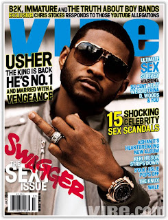
‘Vibe’ is an urban music magazine. It focuses on the genre of r’n’b this is made clear but the artist on the cover and the puffs.

The issues tackled in this magazine are related to the urban industry. Varying from rap artist to r’n’b artists. Articles will include the personal life of artists such as usher as he is on the cover, sex scandals and new music. This is made clear as it’s called ‘THE SEX ISSUE’. I think the target audience is for teenagers and young adults aged 15-23 as the magazine is very youthful and it would be rare that anyone over the age of 13 would be interested in the information this magazine provides.

The main story is about Usher and his married life as well as his number one single ‘He’s No.1 and Married with a Vengeance’. However as this is a sex issue there will be plenty of articles about celebrities such as 50 Cent, Trina and D Woods as they took a ‘sex survey’. The magazine tries to make the reader feel like they are apart of the celebrity lifestyle as they include them in the survey.

The artist on the front is looking directly at the camera which usually means they are trying to build a relationship with the reader, this is called a direct mode of address, but as he has sunglasses it slightly shows a more cool mysterious side to the artist.Usher Raymond is on the front cover as he is very successful and well known in the music industry. He is an r’n’b singer also known as the ‘ r’n’b king ’. This will entice the readers to buy the magazine he is also on the cover because the main article will be about him and his career as well as his new married life; this is made clear as he sticks up his married finger with a wedding band on it.

The artist is giving off a very cool image. He looks like he demands respect and it appears that he is sending out a message to the world that he is happily married letting all other women know he is officially and happily taken.On the left hand corner the buzz word used is ‘swagger’. In relation to this urban music magazine it fits in very well, as in the industry image and personality is everywhere. The font used is very urban and the blood red draws attention to the word, this means the reader is forced to take note of the buzz word it also shows that the magazine varies in information as there is already a lot going on, on the cover.
The title is very bold and eye-catching. It’s in block capitals and in a sea blue which stands out from the rest of the magazine as everything has a mixture of colours. As the artist head cuts off part of the name of the magazine suggests that this magazine is well known which is why they can afford to block out part of the title.

The title is very youthful which links back to why the target audience are for such young people, the image of the title goes with the r’n’b genre. They style of the title is simple but very effective as everything else on the cover is bright, bold and big.
There are many puffs on this cover which show the magazine is filled with a lot of new stories, music, gossip etc. There are puffs such as ‘Keri Hilson Strips Down’, ‘Ryan Leslie Pops Off’ and ‘Ashanti’s Heartbreaking New Album’ each in their own way back up the ‘sex issue’ and the theme of this music magazine.The people who would read this magazine clearly are interested in the genre of music, gossip about celebrities and sex scandals.

The colours used are very vibrant and youthful. The sea blue contrast with the white, yet clashes with the bright yellow and blood red, each colour representing something as red usually represents angry or passion, yellow happiness and blue serenity and peace, these colours used together are a good contrast as they show the magazine will be filled with all these emotions.
There are many fonts used probably to show the variety this cover has to offer, and to entice the readers as one font bores most people and is only generally used in newspapers.This magazine offers many exclusives such as ‘YouTube allegations’, ‘immature boy bands’ and ‘sex scandals’ which is always a good reason to buy it.

Front Cover Analysis 1


'Rolling Stone’ is a music magazine this is obvious because it is a very famous magazine and has been so for many years. Also there is a prop used to draw attention to this. The celebrity uses a guitar to emphasise the theme of the magazine.

From the cover the articles will clearly be about ‘Christina Aguilera’ as her image is on the front cover also it is clearly indicated that there will be an interview when ‘Inside the Dirty Mind of a Pop Princess’ is the only information on the front cover that indicates anything about the contents of the magazine.

The target audience for this magazine seem to be young males and pop fans as the celebrity uses her femininity and womanly figure to entice readers, this will appeal to men as it is very sexual and she is very attractive, it will not appeal to women as much although it will appeal to her fans, and those who love pop culture as she is very big in the music industry for her pop music.
I would say the age group for this magazine is 21+ as no young people read ‘Rolling Stones’ but many people from the older generation do, not because the magazine is for old people but because the articles and images appeal more to them and the price is suitable for a working person, whereas a young person wouldn’t spend their own money on an expensive magazine.
Music is the interest as the guitar is a main focus and also sex as Christina is naked and this focuses on her sensuality and woman hood.The magazine is using a direct mode of address. This shows that they want a personal relationship with the reader; it’s not looking down on them but relating to them instead.

Christina Aguilera is on the front cover because she is a very successful singer and she appeals to many readers, which means the magazine will have more sales.‘Inside the Dirty Mind of Pop Princess’ implies that the artist is very loved in the music industry as the term ‘Pop Princess’ is rarely used, also the reference to ‘Dirty’ suggest to the readers it’s something sexual when looking at the picture this confirms it, also the name of her number 1 single is ‘Dirty’ which also implies the single was quite personal to her.

The artist is giving off a very sensual yet shy message as the anchorage and image are very sexual and simple.The buzz word is ‘Dirty’. This gives the readers a lot to think about as it can be used in many contexts. It also directly links to the main image, which intrigues the reader.
The dark blue clashes with the deep red which makes the title stand out. It’s simple yet effective; with bright colours like these it gives the readers incentive to buy the magazine and also suggests the magazine is not boring as there are no neutral colours.

The title of the magazine tells me that the readers will definitely be interested in music as ‘Rolling Stones’ is a very successful music magazine. The Central image backs this up and shows that it is a music magazine as ‘Christina Aguilera’ is a musician; she will also attract a wide verity of people as she is famous and has a huge influence on many people. The title of the magazine makes it clear that this is no ordinary magazine and it has a rough punky edge to it, this can clearly be seen as the style of the magazine is not the same as other music magazines.

The puffs can clearly be seen but do not stand out, the white text should make it stand put more as its against a deep red, but as the text is so small and thin it’s not the main focus which was probably the intention. The puffs lets the readers know the magazine will be an interview with the star on the front cover; this is made very clear so the readers know exactly what they are paying for when purchasing the magazine. The puffs suggest that it will be an exclusive and there will be gossip, which shows that the readers will be fans of Christina or generally a fan of pop gossip. The reference to ‘dirty’ also attract the male species as the image of her is very enticing; this is usually what attracts men to buying magazines.

Britney Spears Analysis 3


This image has been chosen as unlike the others her face is the main focus allowing the readers to see her vulnerability, every expression on her face has been captured which allows the readers to have a deeper view about her. The use of black and white is significant as it has a dreary and sad feel to it. It immediately sets the tone for the reader which isn’t a happy one. Colour is usually used to show vibrance and life, as the colour is stripped away here it does the exact opposite.

This image was cropped so that her face was the main attraction. Britney’s big hair and body have been stripped to how her purity without all the Hollywood glamour.
This is a direct mode of address which means the artist Is looking directly at the camera building up a personal relationship with the reader. This means that she wants them to see her vulnerability, adding to this it is an extreme close up. This means everything on her face can be viewed very closely, this isn’t rare to a magazine which is not vibrant and happy. The anchorage text supports this as its says ‘Inside an American Tragedy’ this explains the dreary feel to the magazine and also suggest Britney will be talking about this tragedy she is going through.